A year-long case of designing Stepafter across iOS, Android, and the web — solo, with three engineering teams. Two products living under one roof: a creator's web cabinet for building plans, and native mobile apps for the people who actually follow them.
Context
Stepafter is an indie product with a deceptively simple pitch: one place where any long plan — a rehab protocol, a daily medication course, a vaccination schedule for a newborn's first months, a self-authored habit — becomes a doable day. Tasks by time, short questionnaires, daily context, streaks that survive real life.
I joined as the sole designer. Over roughly a year I owned everything end-to-end — interaction model for both sides, visual language, design system across three platforms, specs that shipped into three codebases — and ran product management alongside three engineering leads.
Where I started
The first weeks weren't about pixels. I read rehab protocols and treatment guides to understand the structure of each plan type. A more useful finding surfaced in parallel: there's no standard answer to “how do creators capture a plan today?” Some keep a Google Sheet, some a PDF, some print it out and tape it to a wall. No convention — just a scatter of personal habits. To replace any of those, the product had to know what it was up against first.
From there research split into two parallel tracks. One was qualitative — a series of interviews with real creators across very different specialisations: physiotherapists, personal trainers, doctors, content authors. The point wasn't a single user persona; it was understanding how their day-to-day actually works, which moments matter, what they wish their current tool did, what features the product absolutely had to ship for them to switch. The second track was a wide competitor audit — but not within one category. Stepafter sits at the intersection of four very different product families, and the patterns we needed to borrow live in all of them.
Three pictures the research drew
Patterns from the creator interviews and the four competitor lanes converged into three observations. The product had to take all three seriously at once.
Decision 1 — three primitives, every plan
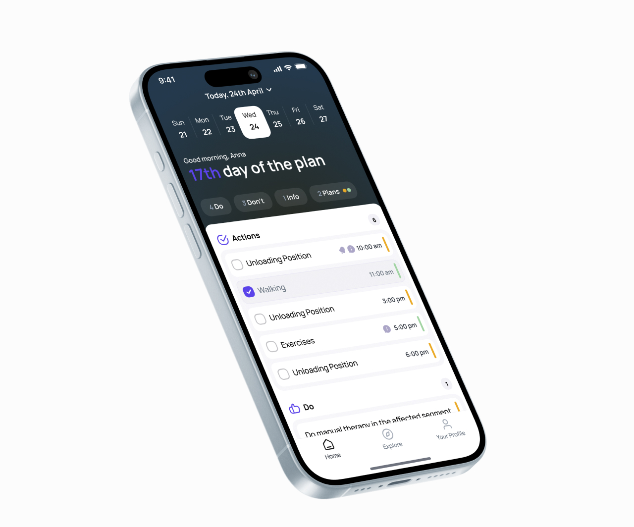
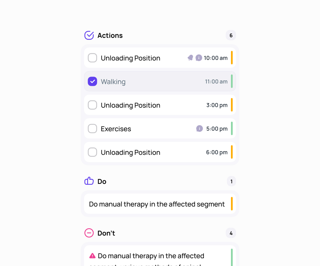
The hardest design problem was building a structure that absorbs every plan type without privileging any of them and without the UI growing under each new case. After several iterations the whole product landed on three primitives: an action (a timed task or checklist item), a do / don't pair (behavioural guidance), and a prompt (a short questionnaire or note).
Any plan — medical, training, newborn care, self-written — resolves into a combination of those three. The daily view on mobile, the Explore catalogue, the plan-detail screen, and the creator's builder on desktop all speak the same language. When QA added dozens of new plan types late in the cycle, the system absorbed them without another round of redesign — which was the test that mattered.
Decision 2 — the creator side gets the harder interface
If plans can't be built quickly and accurately, the mobile side never has enough content for users to return to. That made the creator's tool the gravity well of the whole project — every shortcut we could take out of building a plan paid back tenfold on the follower side.
The builder had to swallow three different shapes of input at once: routine actions (with non-trivial recurrence — every other day, every fourth Wednesday, every weekday but skip Sundays), one-off events (a single procedure on day 14, a vaccination at the 1-month mark), and triggered actions (if the user marks step X done, a follow-up appears N days later). The first version was a dense form. By version four it was a live-preview canvas: the creator builds on the left and watches the follower's phone re-render on the right — every keystroke, including a new recurrence rule or a trigger condition.
Decision 3 — Explore is a marketplace, not a planner index
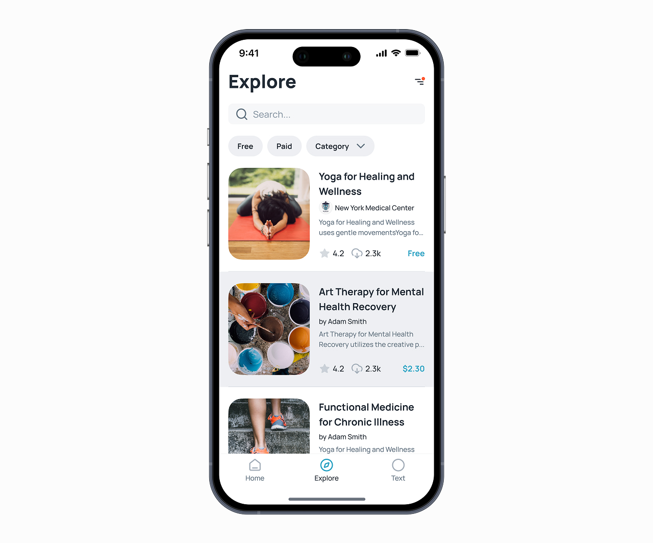
The follower's catalogue is where new users meet Stepafter for the first time. The competitor audit had one strong signal: people coming to browse plans don't bring a “planner” mental model. They bring a “store” one — they expect categories, filters, free vs paid, ratings, search, recommendations. We leaned into that.
Explore is built like a category marketplace. Cards with covers, prices, ratings, install counts. Filters at the top — by goal, by author, by length, by free vs paid. The data underneath is the same plan that the creator built in their cabinet, but the front face of it speaks the language of App Store and Coursera, not Todoist.
Decision 4 — calm over celebration
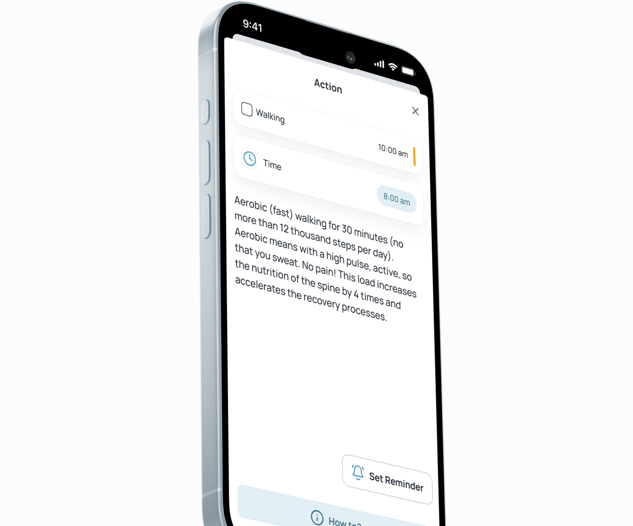
On the follower side, the user should see as little as possible — just the next thing. The whole interface gets out of the way of the actual task. Density that felt productive in mockups was killed in usability testing: nobody could tell what “today” was at a glance. The screen now shows one big now-block, everything else compressed; a short Info step explains the action in plain language. Testers called the result “calming,” which I hadn't expected. The design principle of calm was reverse-engineered from that finding, not set up in advance.
Three decisions I had to defend hard. No global streak counter — a number that grows is a number that can crash; we replaced it with a gentle ring that fills per week, forgives the first miss, and cools only after three in a row. One action on screen at a time — I defended this against a PM request for a “today at a glance” grid through four rounds of wireframes; the grid lived for two weeks in prototype and was killed after testing. No gamification — no points, no levels, no confetti. A follower's reason to return has to be their real life, not our cute loops.
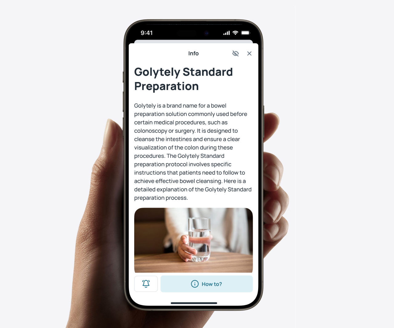
One design system across three platforms
Supporting web, iOS, and Android simultaneously with three engineering leads and no other designers meant the system had to do a lot of work on its own. I built one token layer (colour, spacing, type, motion) and three surface libraries on top of it: Figma components for the desktop creator tool with an HTML/CSS reference, components aligned with SwiftUI for iOS, and Material-aligned components for Android. Same decisions underneath, native idioms on top.
Reviews ran in a shared weekly meeting — 30 minutes per platform, sign-off in the same room. By launch the system had a solid set of core components and variants, a motion library, voice-and-tone guidance per plan family, and documentation the engineering teams could work from without me in the room.
Minimalism isn't a starting principle — it's a result. The universal structure started to work only after the specific cases and the creator's workflow were understood well enough.
What I carry forward
Two things that travelled out of Stepafter into the projects after it.