MSTV iOS is the consumer news app — editorial stories, video, and a push rhythm tuned to real race weekends.
Between sessions the fan lives in their phone. The app had to feel like a well-edited magazine — fast to scan, kind to notifications, easy to pick up and put down.
The timing of push notifications was the subtle win. We mapped the full race weekend and aligned notifications to the rhythm of actual sessions, not to arbitrary content drops.
How we worked
Research started from the opposite of a race weekend — the six days between. Most of the fan's time with the product happens when nothing is on, and the app had to earn its place on the home screen in those quiet days. That reframed the whole catalogue: not a firehose of content, but something closer to a well-edited magazine — stories worth coming back for, not every clip we had.
Then the race weekend itself. Mapping it was a ritual — five sessions, practice through podium, ten drivers worth tracking, the parts where something always happens. Notifications followed that map. I argued against the default 'new clip dropped' pattern and pushed for session-anchored pushes — 'quali starts in 20', 'result is up', 'podium interviews' — tied to real race-weekend beats. Open rate tripled across the first four weekends it ran.
The subscription flow was the last stubborn piece. Standard premium-paywall patterns — blur the content, show the price — read as a wall. We built a two-minute preview that starts playing at full quality and fades into a paywall at the cliff of the story. Softer, honest, and conversion was better than the blur by a clean margin.

What shipped
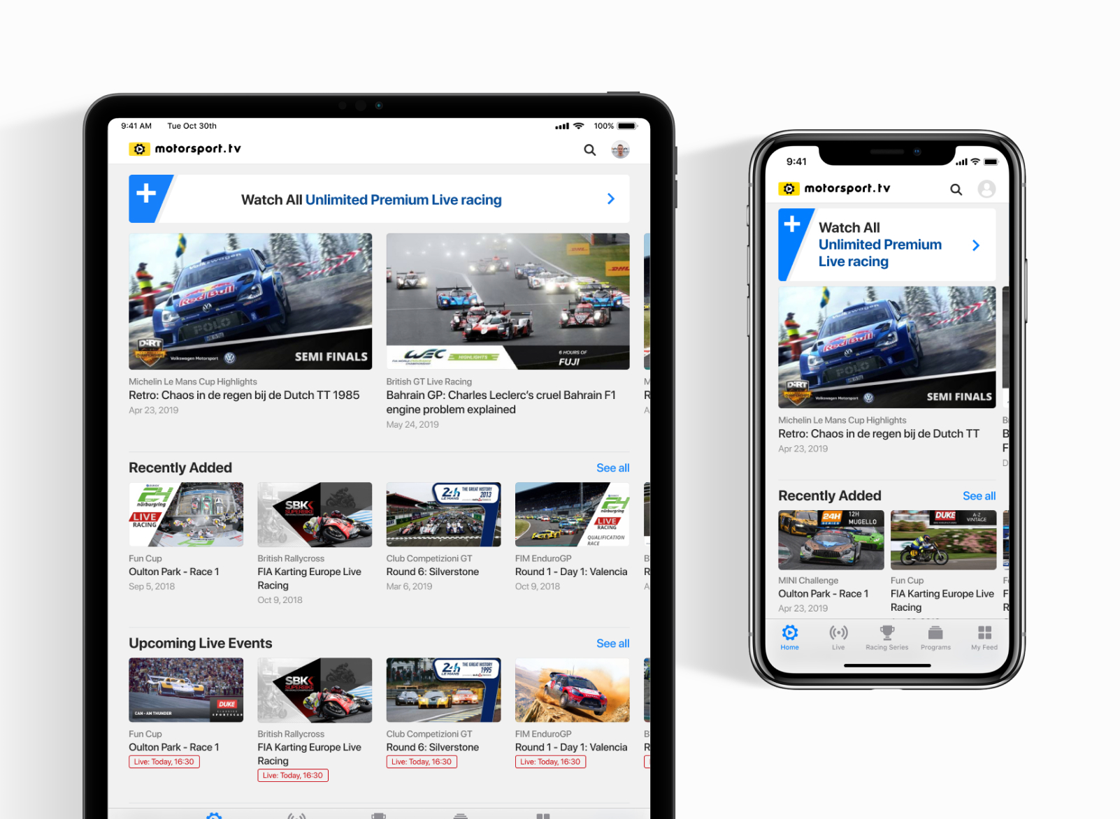
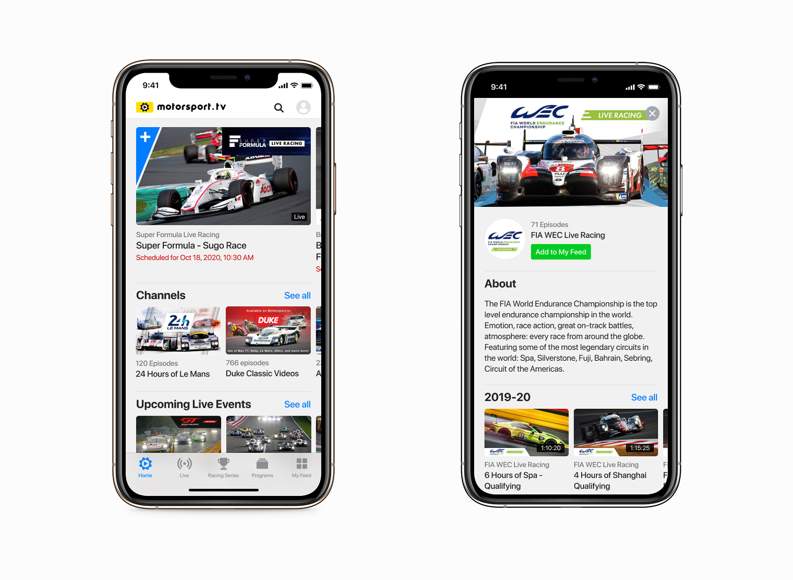
- Full mobile catalogue: live races, on-demand, channels, series
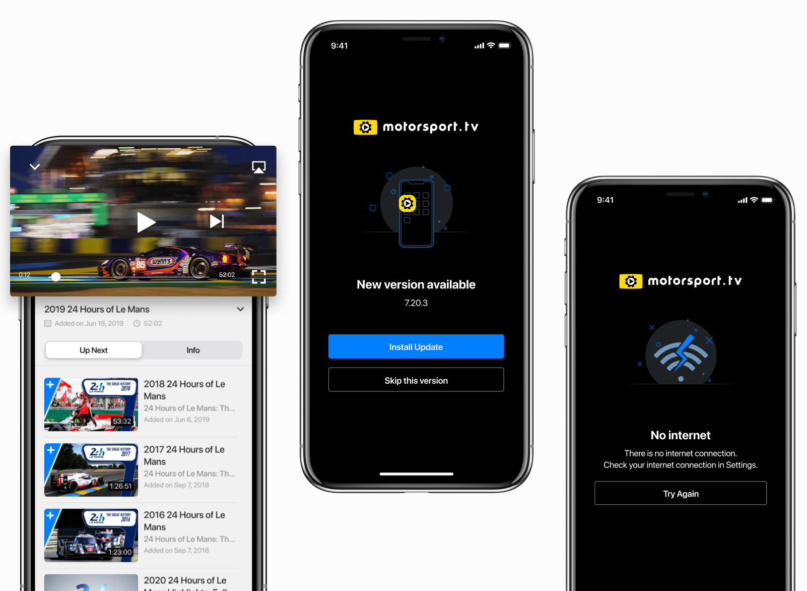
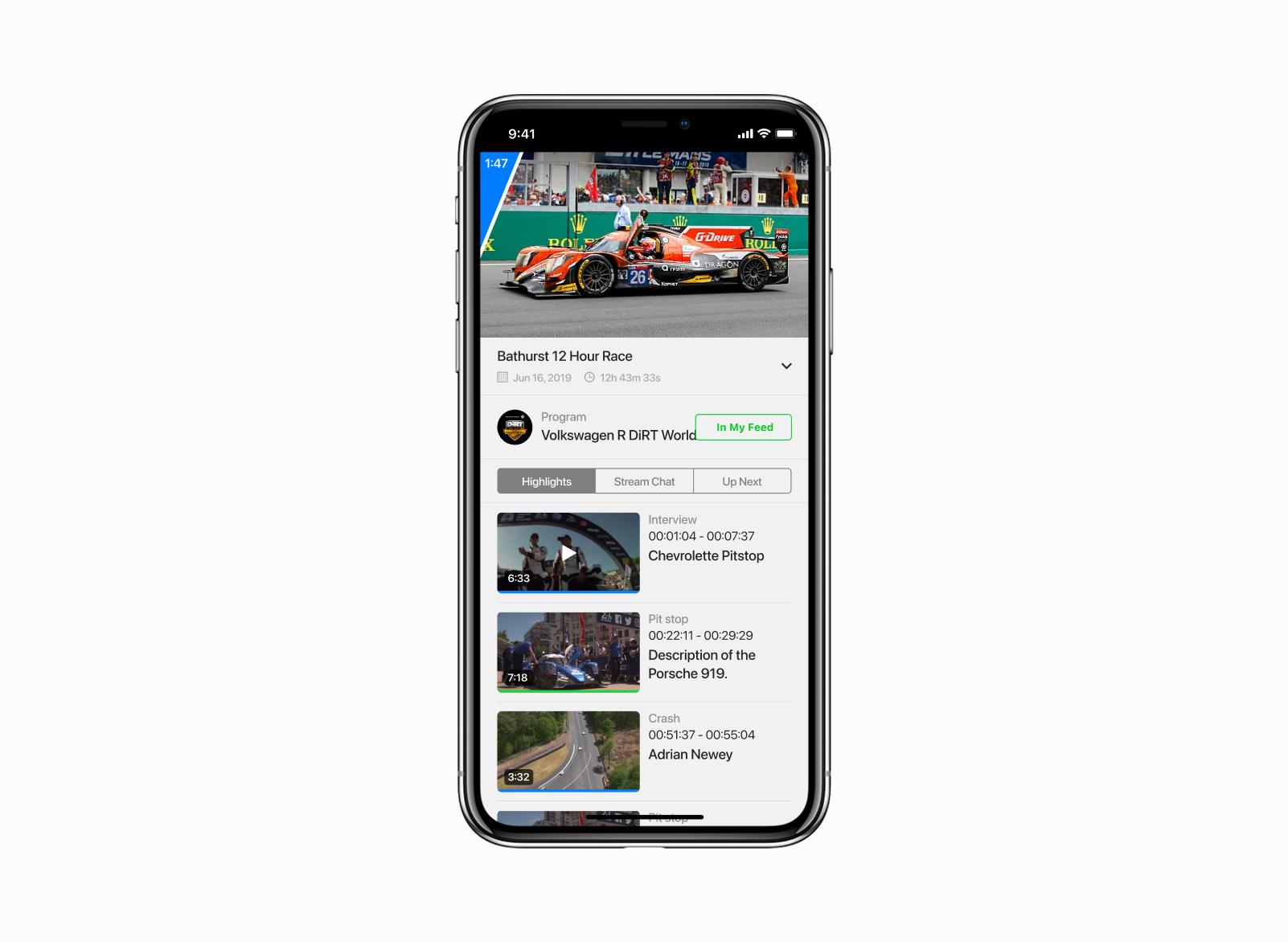
- Custom video engine with live, VOD and multi-angle support
- Subscription system with two-minute premium preview
- Channel and series subscriptions, history, recommendations
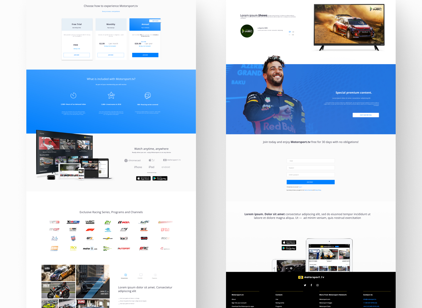
- Companion promo landing page for the product
Closing note
The hardest part wasn’t any single screen — it was making the iOS app feel like a real OTT product, not a downscaled web view, while keeping the same depth of catalogue and the same subscription logic.