A deposit screen with a 30% conversion. Support drowning in tickets about the same five steps. Most of the funnel on a phone. Here is how the Deposit flow inside B2Core got rebuilt — what we changed, what we didn't, and what the early numbers say.
Context
B2Core is B2broker's flagship white-label product — one client cabinet sold to 100+ brokers, each of them launches it under their own brand. Deposit is the most important step in the funnel: if a new user can't get money in on the first try, everything downstream stops existing.
Early 2026. My role on this flow — product designer with end-to-end ownership: research, analytics, prototypes, testing, hand-off, production check. Not one of many designers waiting for tickets.
Three signals we couldn't ignore
Amplitude said only about a third of new users finished the deposit flow on the first try. Support said the same scenario kept showing up under different names. And 70% of the people we were losing were on a phone — exactly where the UI had been built the worst.
What support kept hearing
Tickets settled into four steady patterns. They weren't dramatic. They were dull, repetitive, and obvious — once you read fifty of them in a row.
“Where did my money go?”
User funded the account, balance still shows zero, no idea what happened.
“I don't know what to do.”
No instructions inside the flow, so any non-obvious step led straight to support.
“Too many buttons and options.”
Cluttered UI, duplicated secondary functions, the primary scenario lost in the noise.
“Why are there so many steps?”
Five to seven taps for a routine task — every extra fork was a chance to drop off.
How we dug in
Three lanes of research, all running at the same time. They were chosen so each one would fail differently — that way the patterns that survived all three were the ones worth acting on.
Three insights everything hinged on
All three were the kind of thing that's obvious in hindsight — and that you can't be sure about without the data.
Decision 1 — a shorter path
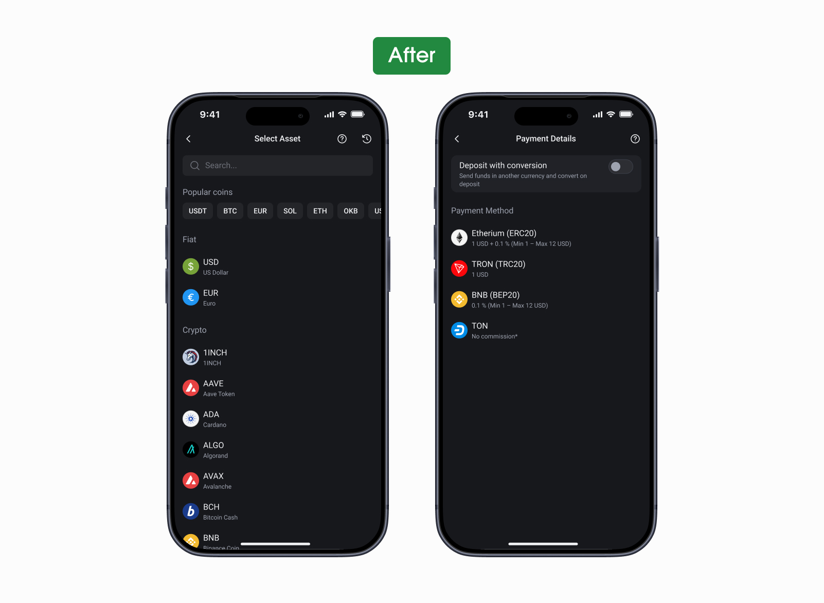
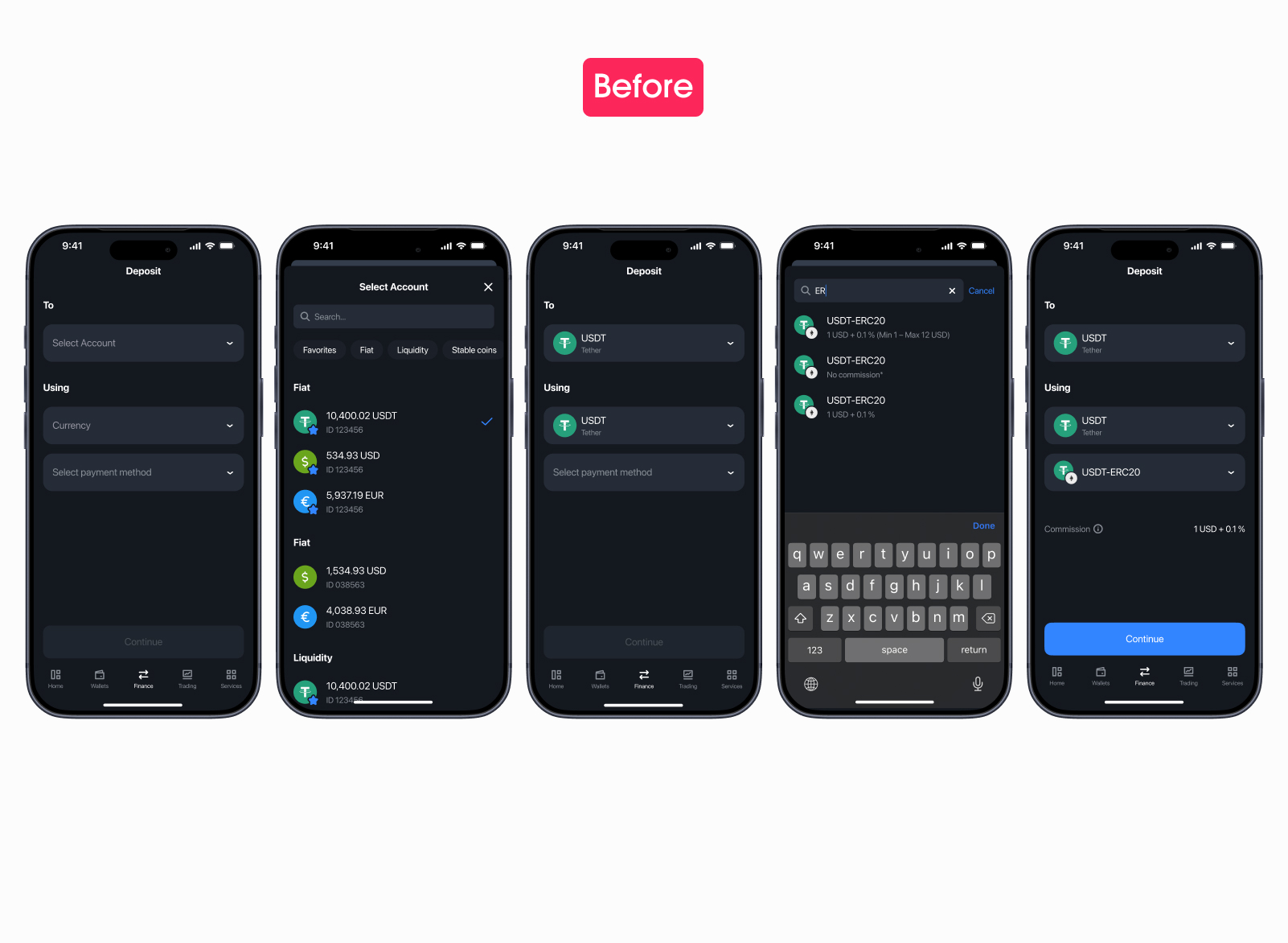
The old flow took five taps to reach the deposit address in the basic case, seven with currency conversion. Most of those steps were dropdowns sized for desktop and dropped onto a phone screen — a form-filling exercise more than a payment flow.
The new flow lands the user on the address in two taps. Dropdowns turned into full-screen pickers with search — more breathing room, faster to find the right wallet or asset, no fishing for tiny tap targets.
Decision 2 — conversion goes opt-in
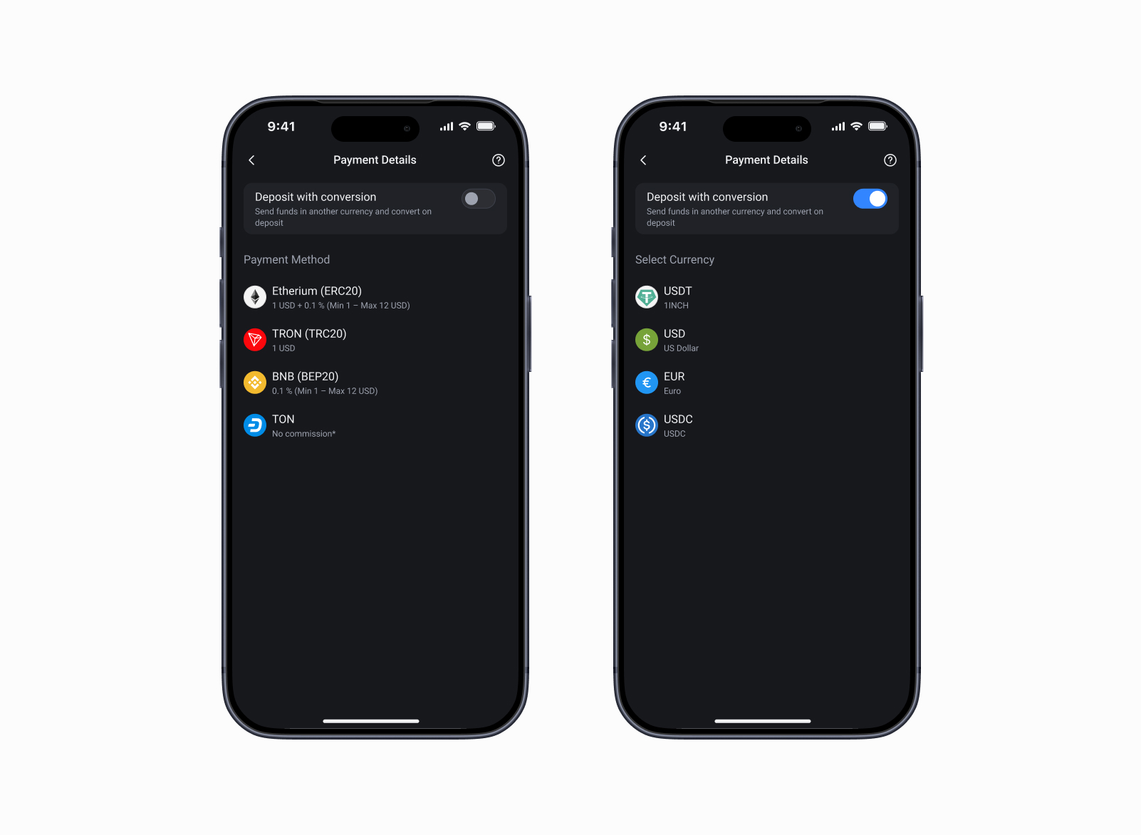
Analytics had the answer ready: in 95% of deposits, the currency on the way in is the same as the currency the user just withdrew from another platform. All seven steps with conversion selection existed for the 5% who actually need it.
Decision 3 — FAQ at hand
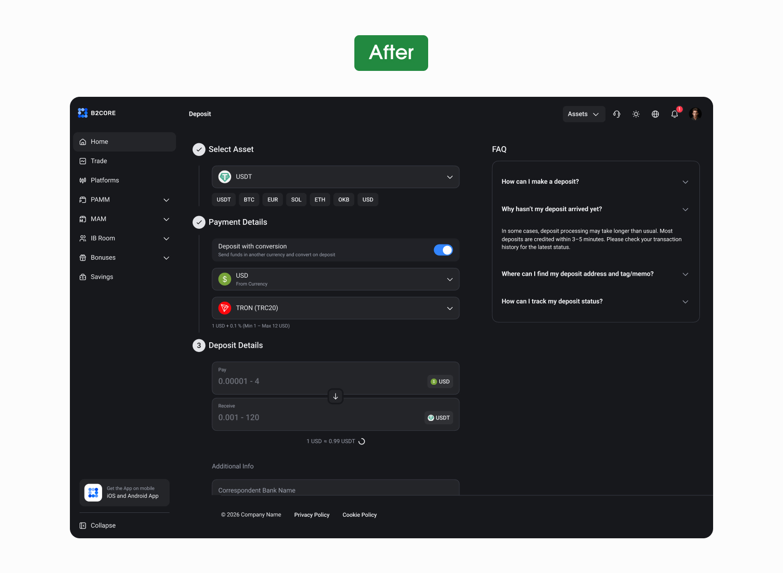
The quietest of the three decisions, and the cheapest to ship. The pattern came straight from the competitor audit: six of seven major players keep an FAQ pinned right next to the deposit form. No one sends the user off to a help center mid-payment.
On mobile the FAQ opens as a bottom sheet — a tap away, scrollable, can be dismissed without losing the form state. On web it sits as a fixed right column. Same content, same questions, two layouts depending on what the screen can give us.
Old and new, side by side
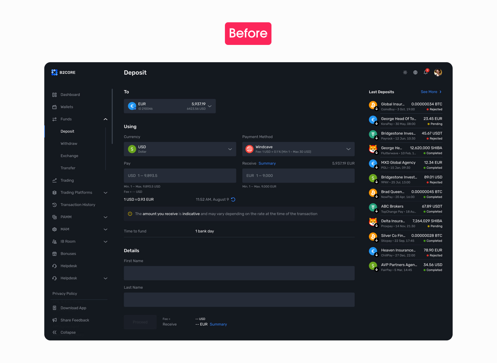
Short version. On the left — a cluttered form, dropdowns inside dropdowns, and a sidebar showing other people's deposits, which doesn't help you make your own. On the right — three numbered steps, an FAQ where the noise used to live, and the Deposit button where the eye lands first.
Same product, same brand. The hierarchy is the change.
What the numbers say
Honest framing first. The new flow rolled out to a handful of clients, and it's been under two months since launch. The numbers are real but they read as “where this is heading” rather than “proof”. The full-audience read comes later, on a longer horizon.
Most of the lift came from things we removed. Five steps became two, a required block became opt-in, and the help moved next to the form instead of into a separate section.
What I carry forward
Three things that travelled out of this case into the next ones.